Supabase for Everyday Users - Ai Database Assistant
This was inspired by a real customer need recently, helping them build KPI reports in Supabase!

Sponsored by Supabase!
Why Are We Talking About a Database?
Lately I’ve been focusing on no-code tools — the kind of stuff that lets people at their desks just get things done without knowing how to code, without knowing the in’s and out’s of AI or technical pieces. So why am I bringing up a database?
Because Supabase isn’t really just a database. It’s also a friendly layer on top of a database that makes things way easier to work with. And if you’re in a situation where your team or company is already using Supabase and you find yourself intimidated, don’t worry. I want to show you some ways to use it and get past the intimidation. Because honestly, Supabase does a better job than most at making databases approachable for people who don’t know anything about databases, SQL, or any of that technical stuff.
Now, it would be great for you to eventually learn about database relationships and how to think about data — so you know what questions to as Ai, but we’re not doing that here.
Here’s what we are doing. Simply, these three things in Supabase:
Using the built-in AI to talk to your data — in business language, not tech language
Building a quick dashboard with those reports, like KPIs
Automating a weekly report that goes out every Friday to leadership — no effort from you after the setup using a database report you built! We will even use Nano Banana to generate the charts!
Let’s dig in.
The AI: Ask Your Data Questions
AI is easy to throw around as a buzzword. But when companies use it the right way, they put it directly into their application so you can use the tool without being an engineer, or an AI expert. You just know your business and what you’re trying to get done, and the AI helps you do it. That in my opinion is where the magic of making a good user experience happens. And I think you’ll see that’s exactly what Supabase did.
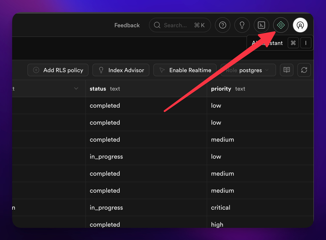
Right inside the interface, there’s an AI assistant. I wish they always left it open by default — it’s that good. You just talk to it about your data.
[

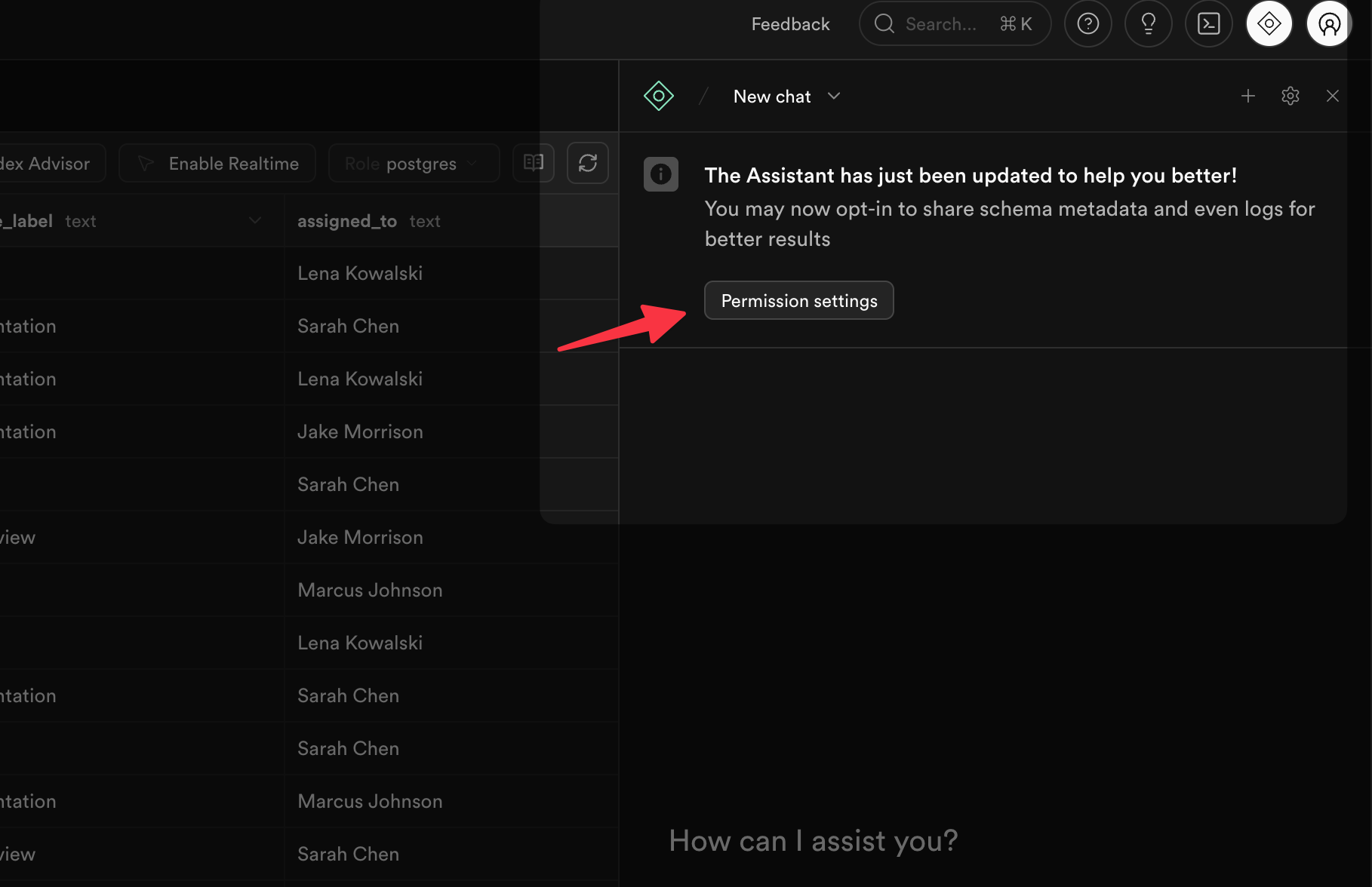
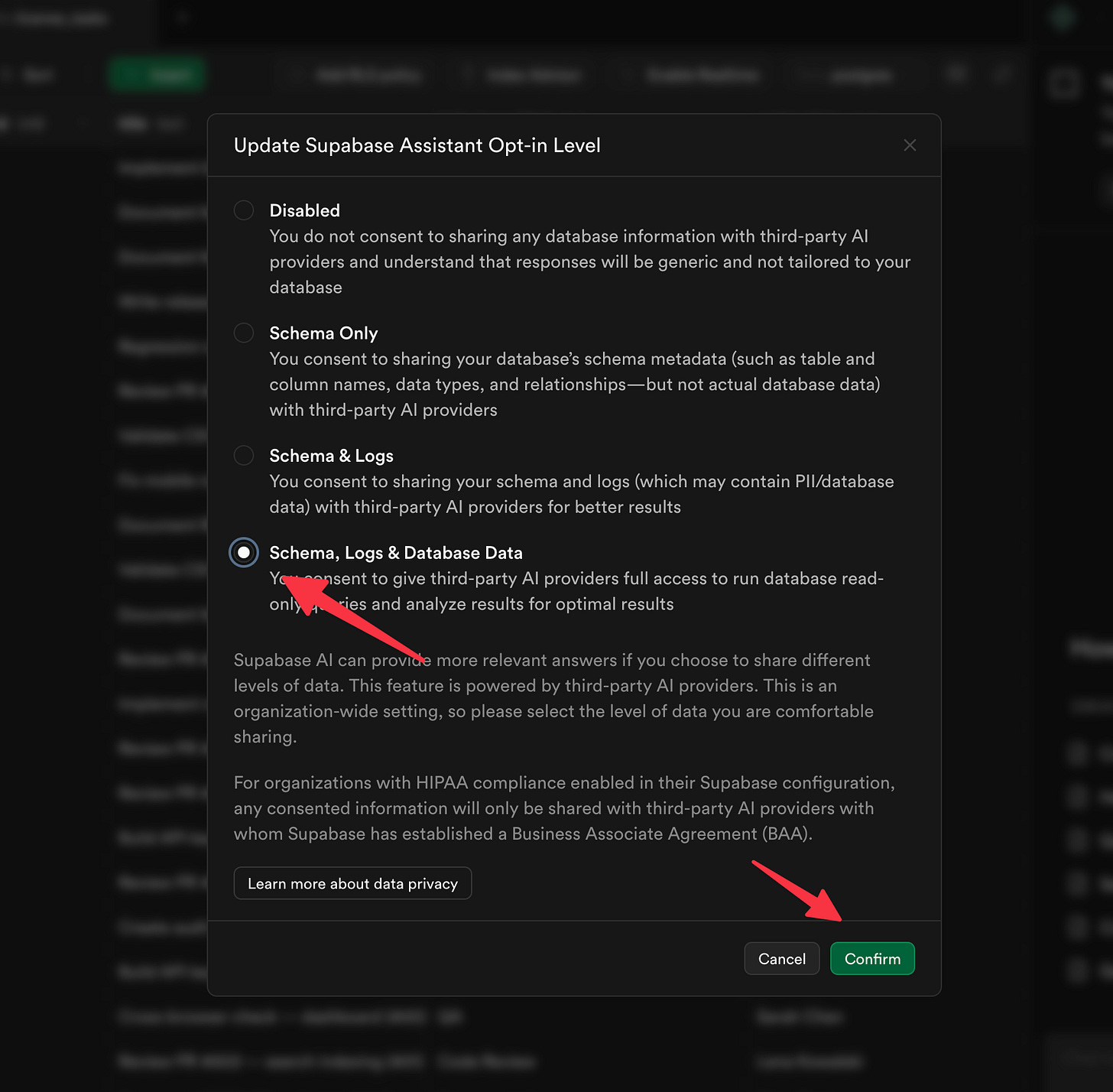
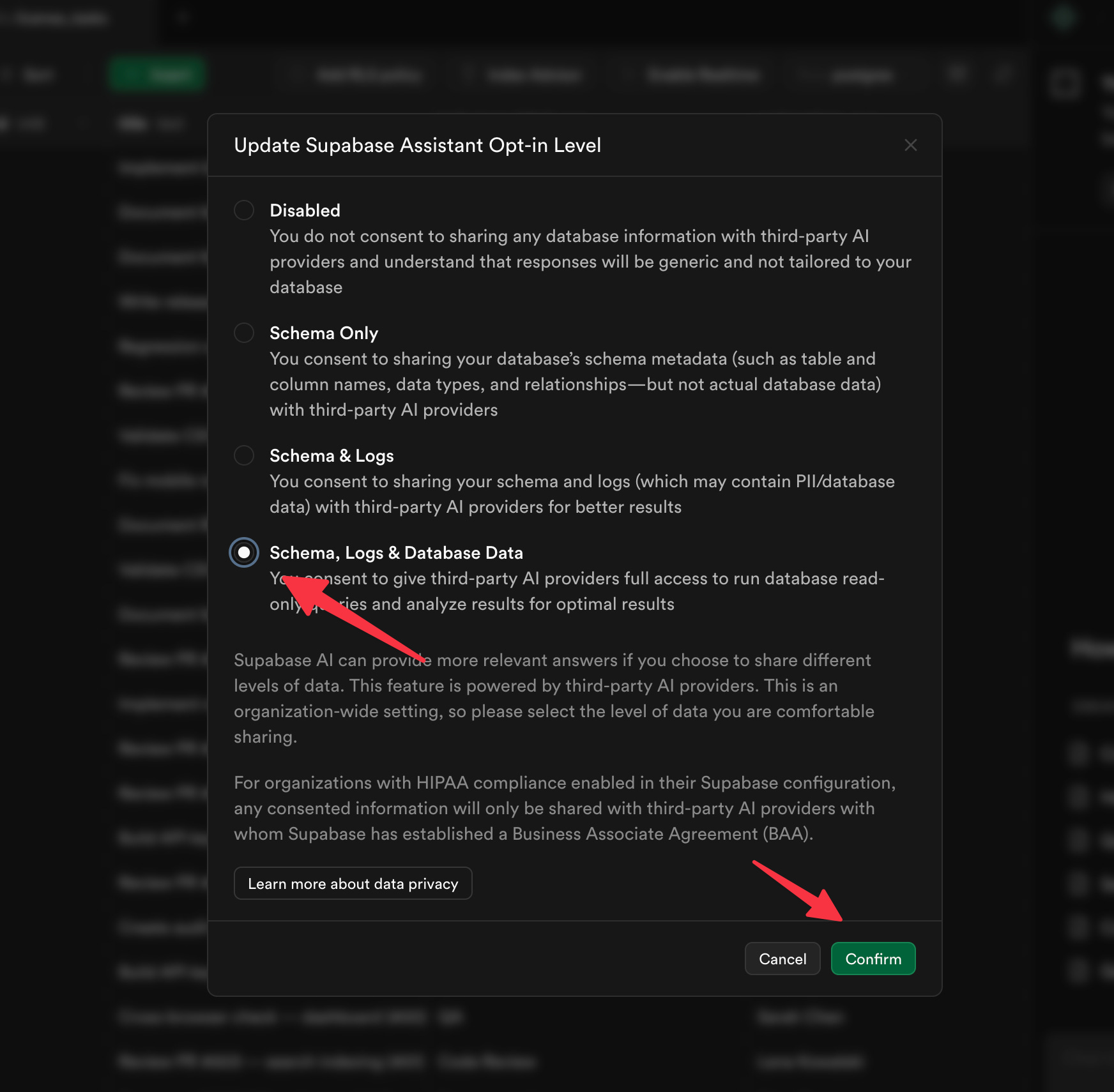
The first time you click it, it’ll open up a sidebar and ask a few questions.
[

And then:
[
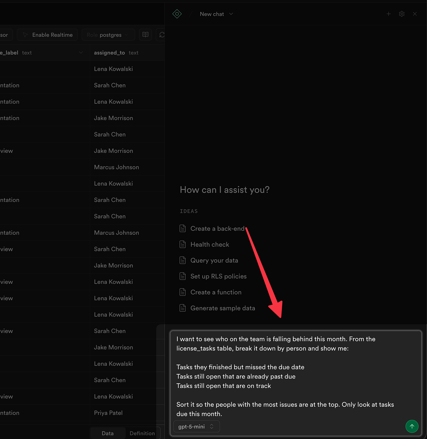
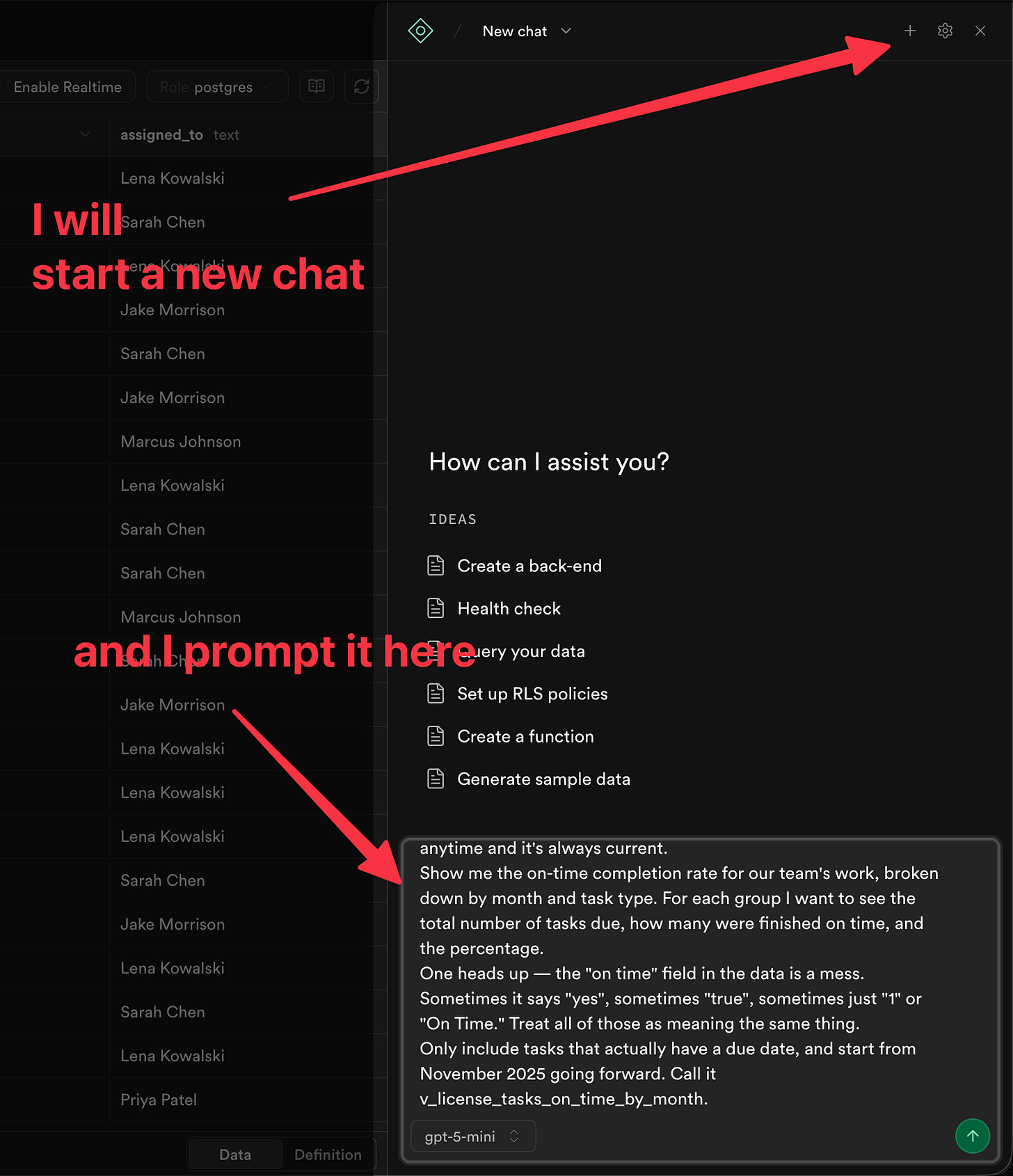
So let’s say I’ve got a table of tasks — things the team has completed, who they were assigned to, when they were due, all of that. Maybe you’re tracking maintenance requests, or sales follow-ups, or grant deliverables — same idea. And as someone responsible for keeping things on track, I need to build some KPIs.
I just type something like:
I want to see who on the team is falling behind this month. From the license_tasks table, break it down by person and show me:

Tasks they finished but missed the due date
Tasks still open that are already past due
Tasks still open that are on track

Sort it so the people with the most issues are at the top. Only look at tasks due this month.
[
In a few moments you get this:
[

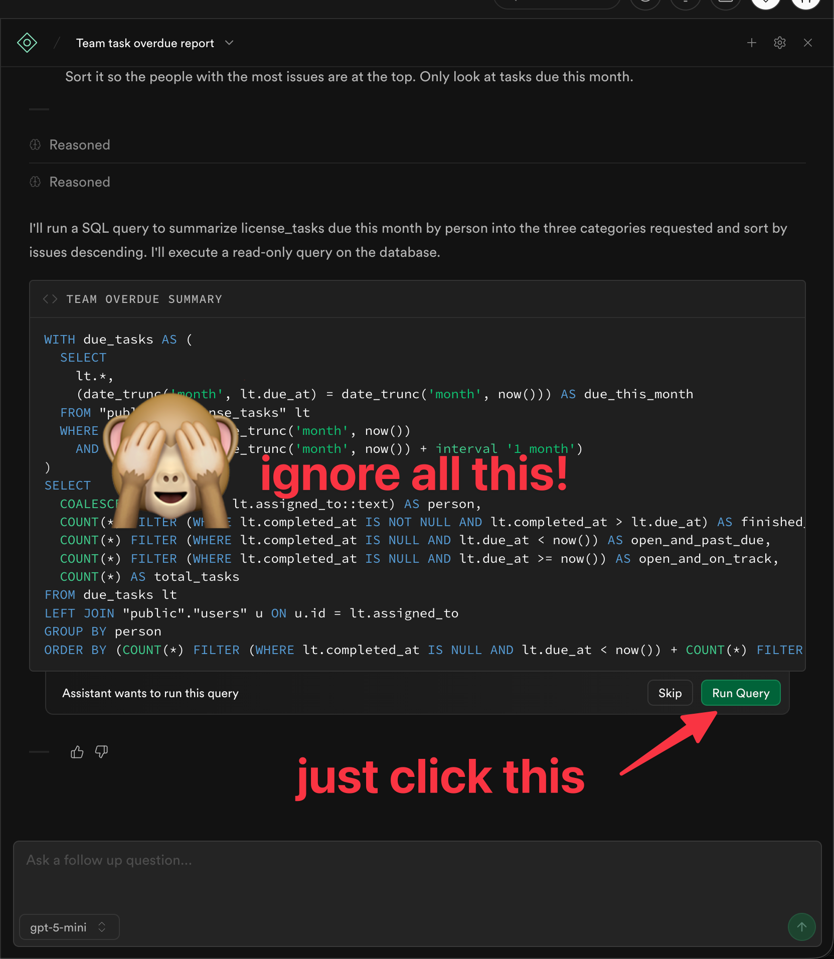
NOTE: See that warning? You can ignore it. You’re just asking questions about your data — you’re not deleting or changing anything. And if you ever did try something destructive, Supabase would hit you with a big “ARE YOU SURE?” confirmation first.
That’s it. I’m speaking in business terms. Not writing code. Not writing SQL. The AI figures out how to ask the database for me, runs it, and gives me results. It even offers to show me a chart.
And we get:
[
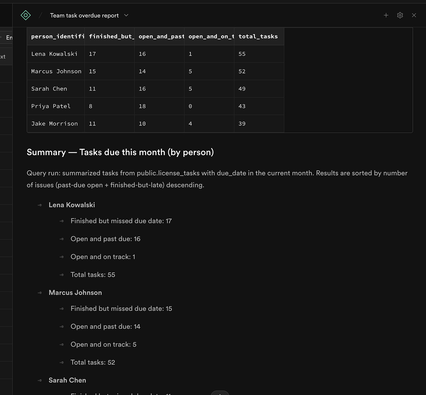
Pretty neat. But I’d really rather not have to do this every time — so let’s start building a quick dashboard.
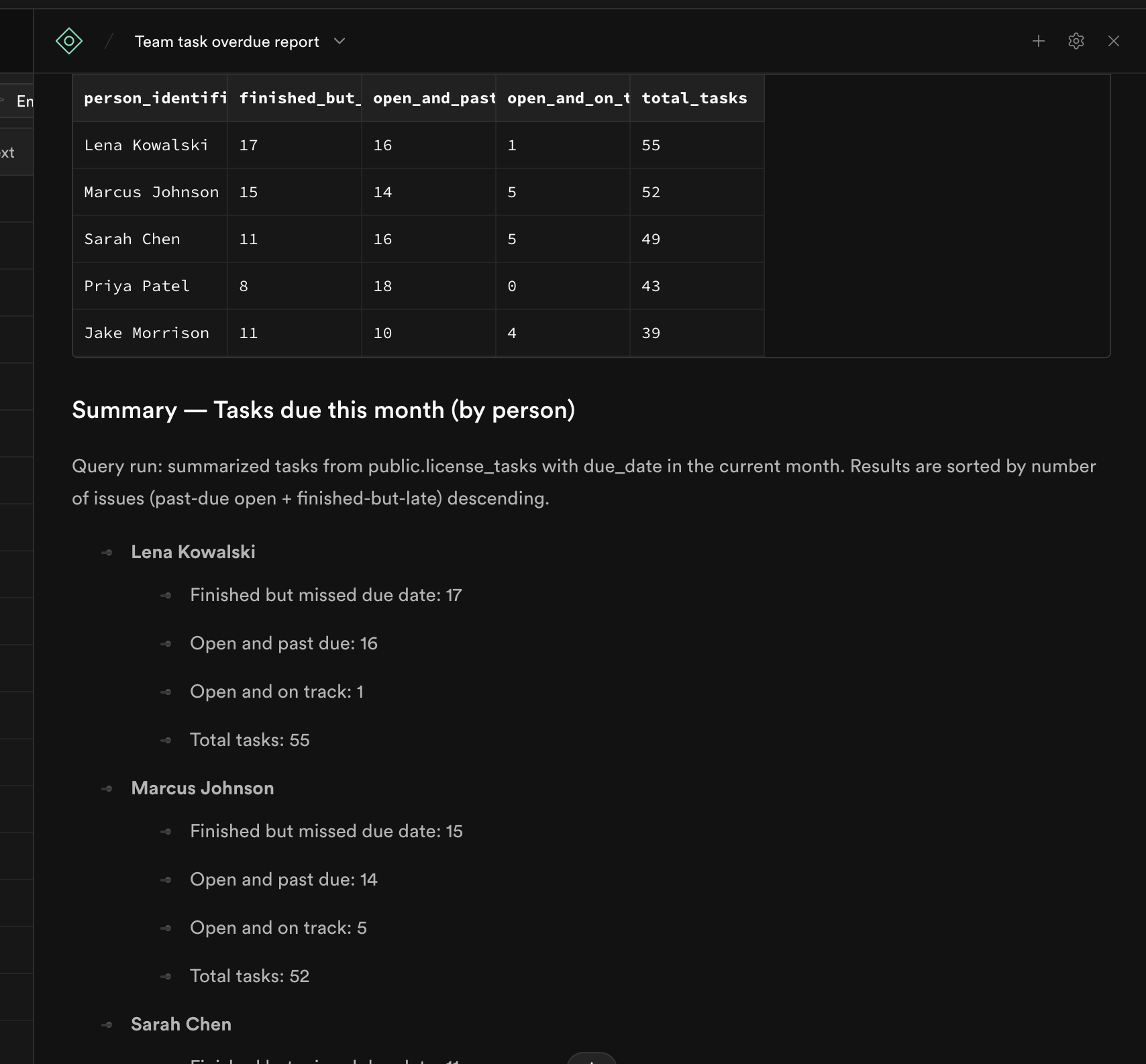
Lets copy that query to the next step:
[
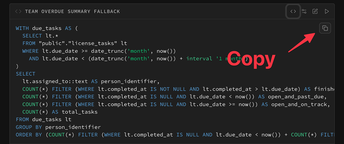
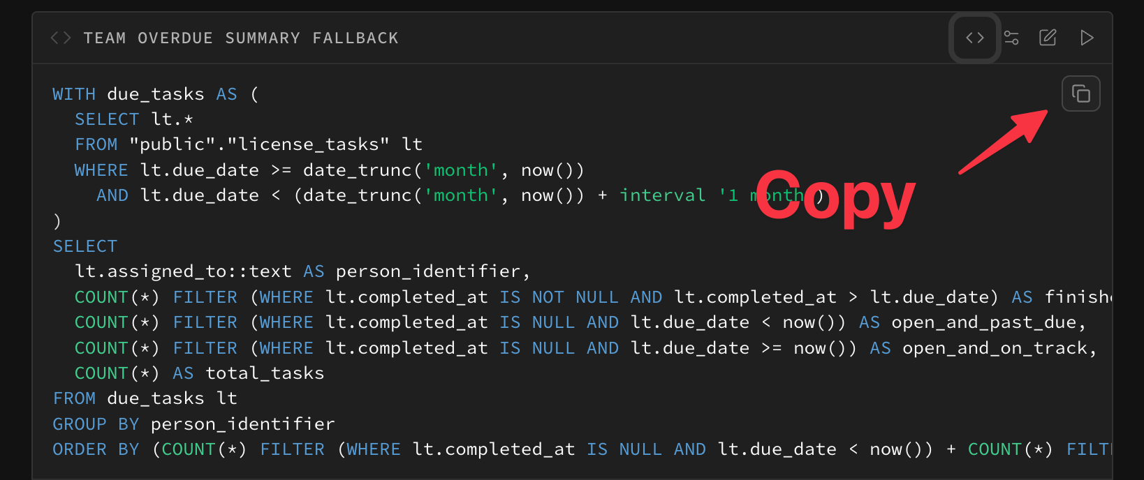
💡 If you get an error, just run it again and let the AI work through the problem. It usually sorts itself out.
[

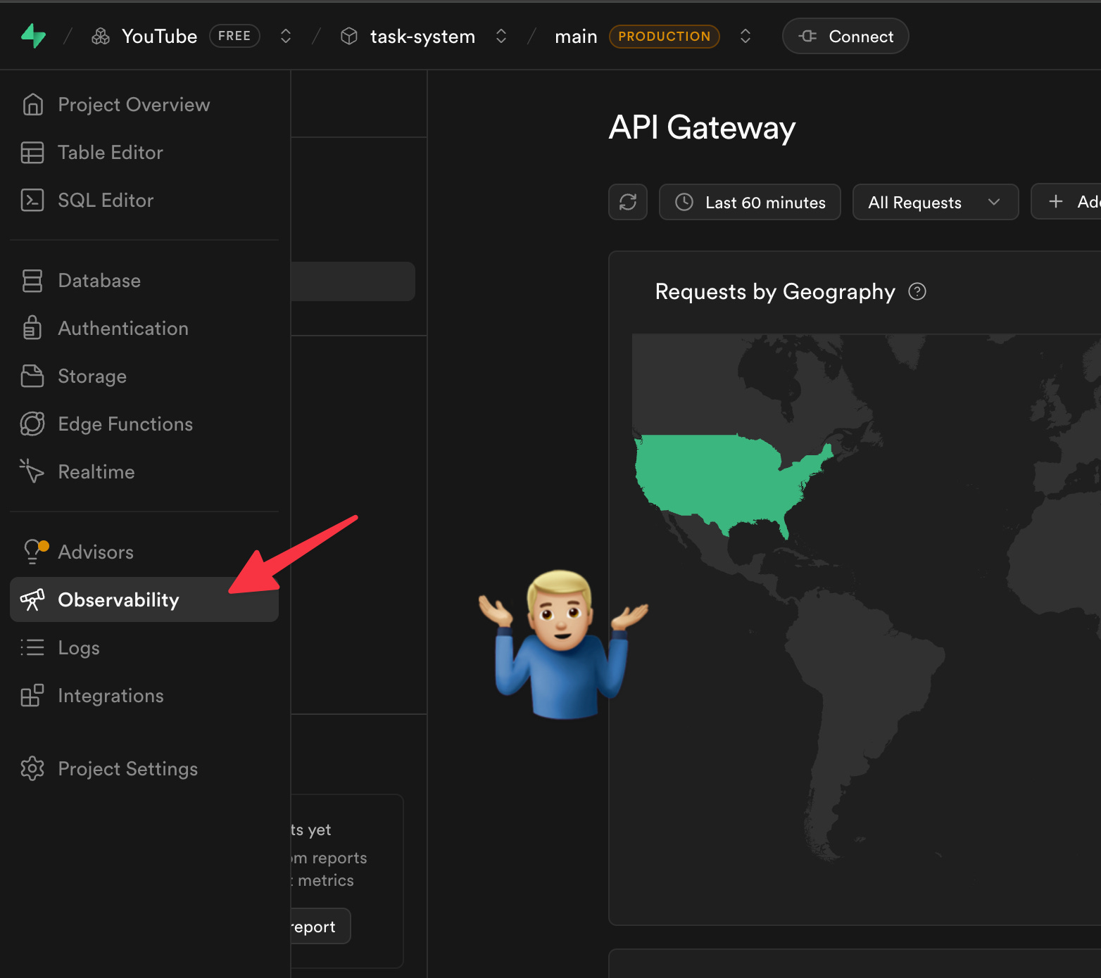
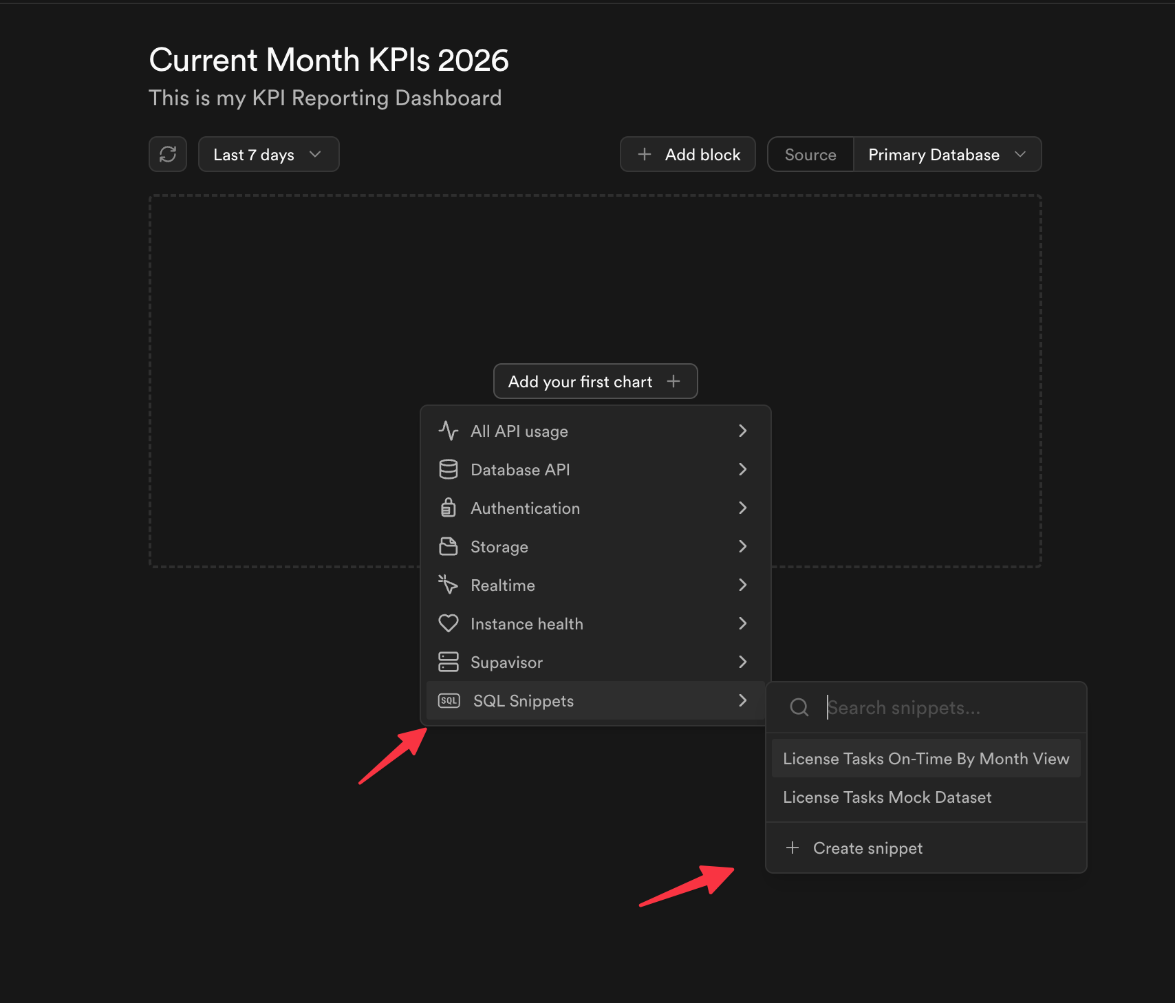
Building a Dashboard
Ok so now let’s go over to the dashboard area and paste that report to start building. Here’s how we get there.
[

Why is it buried here? It would be nice if they called it something clearer like “Reporting Dashboard” — let’s all send them that feedback.
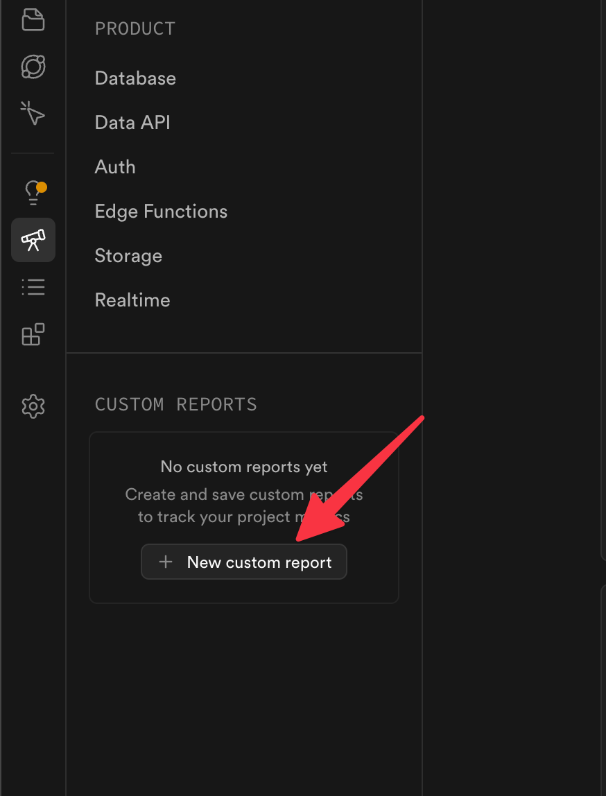
Once there, I create a new report area.
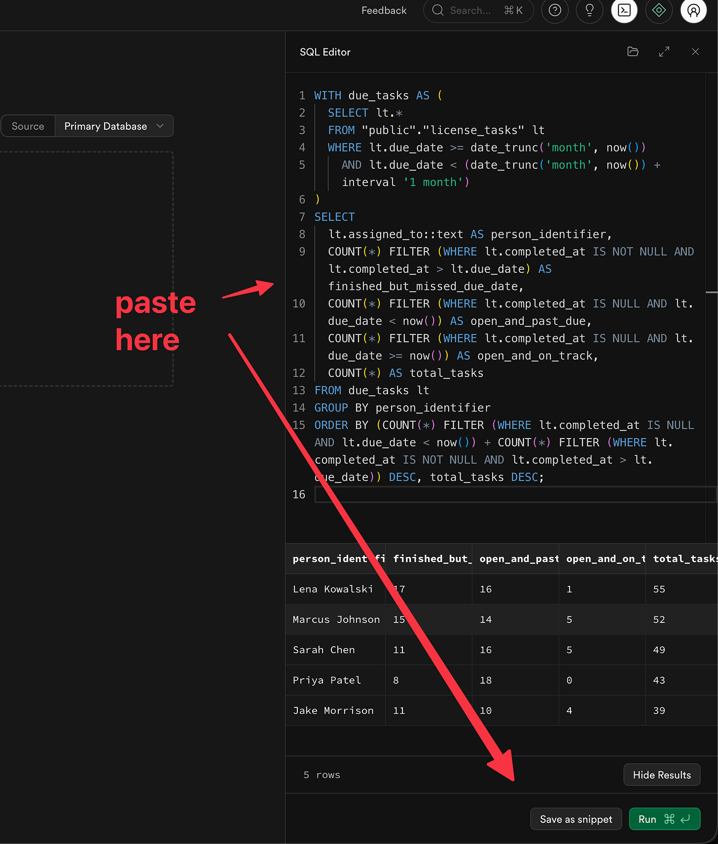
Ok getting close. At this point we’ve got that report query the AI made for us copied to our clipboard. Now we can make a new snippet — that’s just a saved report inside the dashboard. We can do this a few times with the same report to make different charts.
[
[

Then we paste and save.
[

Give it a good name here like “Open and On Track” — that way when you make another snippet, you can show the same data as a different type of chart (bar chart, line chart, etc.).
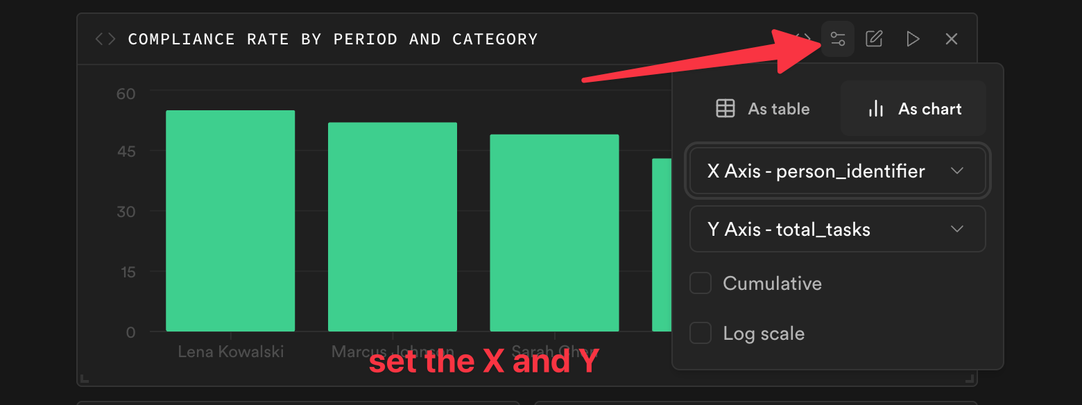
And once we have our new area we can add that “Saved Snippet”
Set the X and Y:
[

Alright, a few of these later and we’ve got ourselves a nice dashboard!
[

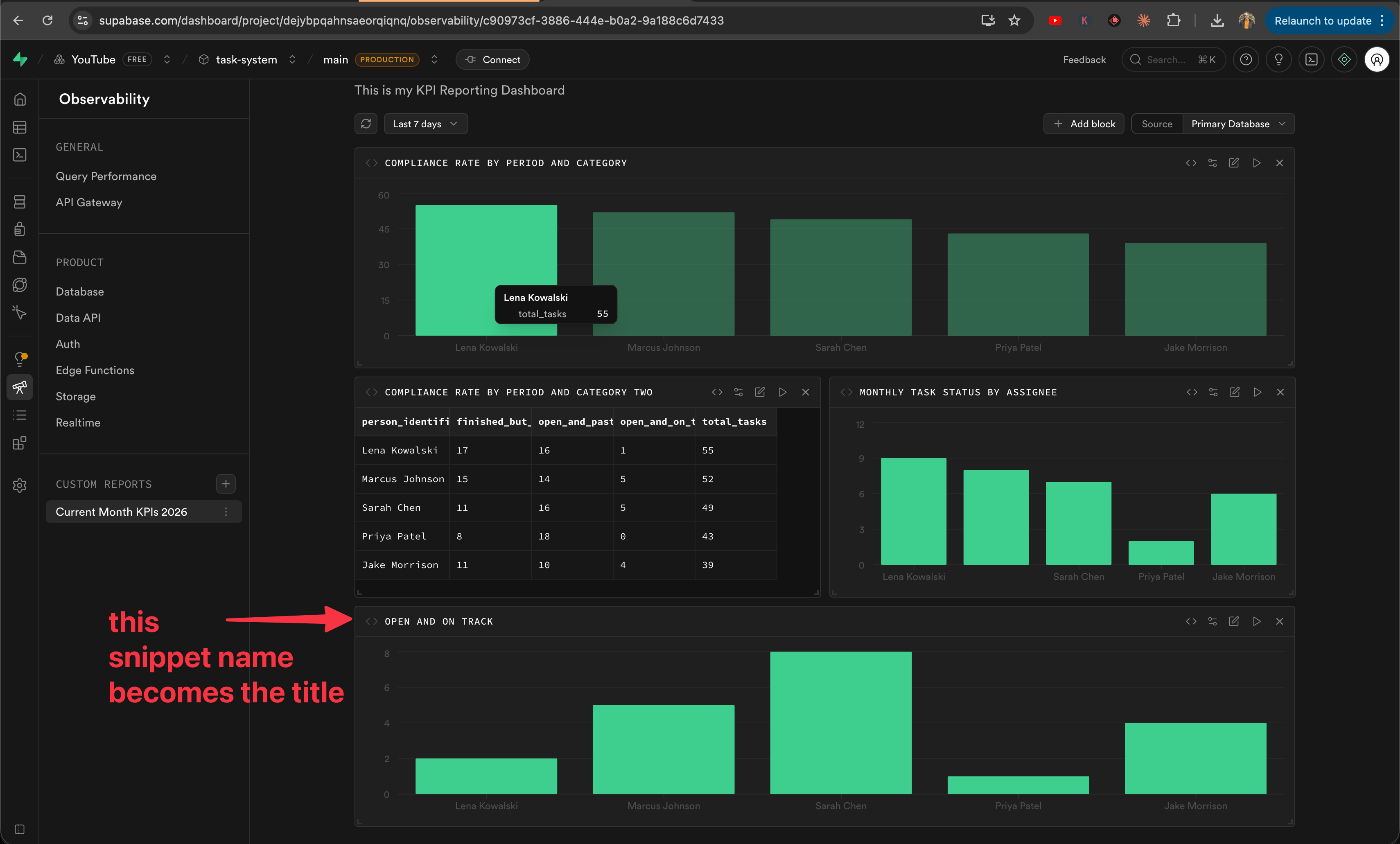
Here’s what is also nice: instead of exporting results as a spreadsheet that’s outdated the second you download it, this is “live” data. Every time I open the dashboard, it runs the current report for this month. Always fresh.
💡 Make sure to Save as you go!
So let’s recap: we used AI to generate the technical stuff behind the scenes to solve a business need, and we used the dashboard to show that data in real time for me and the team. But now I want to show you how to deliver this data to leadership automatically — without lifting a finger after setup.
One New Word: View
OK, here’s the one slightly technical thing I’m going to ask you to learn. One word: View.
A view is a saved question. Instead of asking the database the same complex question every time you open a database, you save it once with a name — and from then on it like a database table. The data is always live and up to date, it’s not a copy or a snapshot. Think of it like a saved search filter in your email — the emails keep changing, but the filter stays the same.
Once you have a view, you can connect it to other tools. Which is what we are going to do. We are going to use this View to do two things:
Send a weekly report to the team and leadership
Make a fun chart out of it using NanoBanana (an AI tool that turns data into nice-looking graphs)
Once again I go back to the AI assistant and ask it to create this new report.
[
Keep in mind — I use another AI tool (like ChatGPT or Claude) to help me phrase my request clearly before I paste it in. The more you can use these tools to sharpen what you’re asking for, the better your results will be.
And what we get is something that looks just like another table in the database.
[
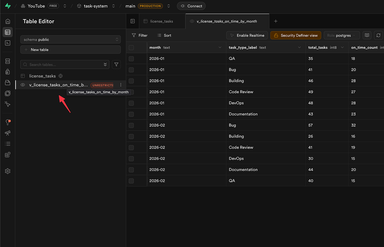
That’s it! You now have a saved report you can use in other places.
Side note — see that brownish warning? That’s just a security reminder. Three clicks and it’s gone.
[
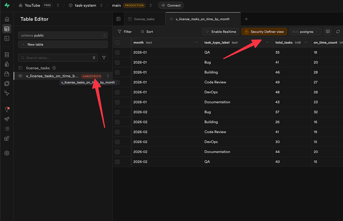
Just click the button, hit Autofix, then Confirm — done. Since this is your own report, there’s nothing to worry about breaking.
Nice! Now let’s go put that view to work in our weekly report.
The Friday Report That Runs Itself
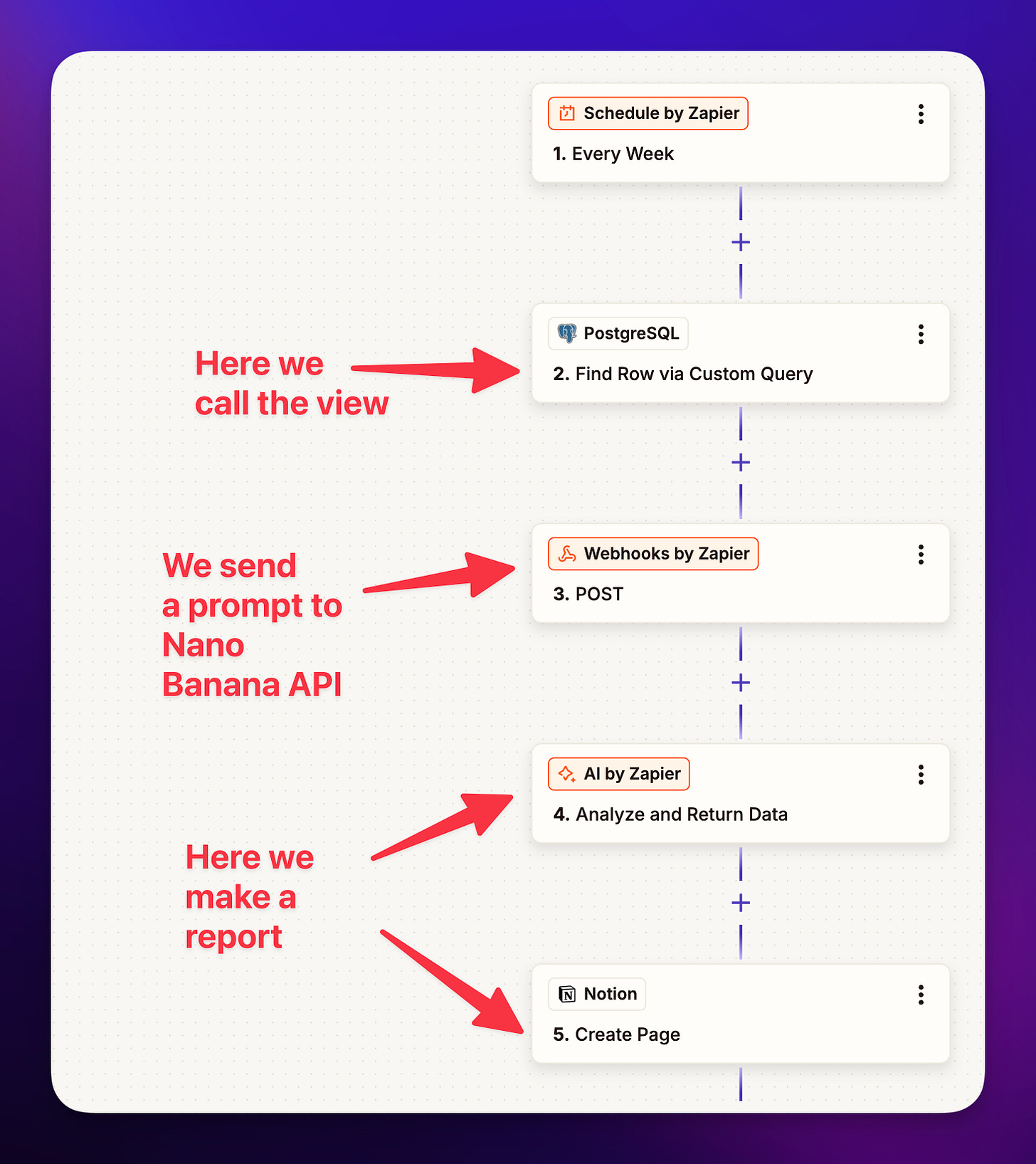
Here’s where it all comes together. This will save your time weekly sending this report to the team and leadership.
I set up a Zap — that’s an automation in Zapier, a tool that connects different apps together — that fires every Friday morning. It connects to our Supabase database (I link to the docs below), grabs the data from that view we just created, and then:
[
Hands the results to an AI step that turns it into a nice-looking graph (I used NanoBanana AI for this — it’s just a fun tool that makes charts from data. I pasted my NanoBanana prompt at the end of this article for you to copy)
Sends an AI-written summary to a Notion page (Notion is like a shared wiki/document hub a lot of teams use) where leadership can read it
[

That’s it. Every Friday, the boss gets a polished report with a graph showing how the team is doing. I never have to touch it again. It just runs.
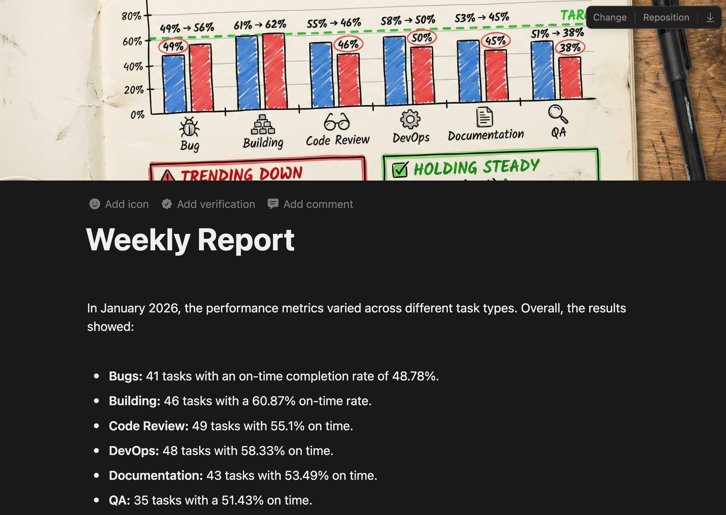
This is the report image we output:
[

Maybe you’re an office manager tracking purchase orders, or a coordinator juggling grant deadlines, or a team lead keeping tabs on project milestones — whatever the data is, the pattern is the same. Ask the AI, save it as a view, automate the delivery. .
NOTE: We could have built this report directly inside Zapier, but the advantage of a View is you can also look at it anytime as a table right in Supabase — making it something worth understanding on its own.
What You Just Did
Let’s step back for a second. You just:
Asked a database questions in plain English — no code, no SQL
Built a live dashboard that updates itself
Learned one new word — “view” — and used it to connect your data to other tools
Set up an automated weekly report for leadership
And the only database concept you needed was “view.” That’s it. The person closest to the problem is now the person solving it.
Give It a Try
Here’s my challenge to you: if your team is on Supabase, open up that AI assistant and just ask it something. One question about your data that you’d normally have to bug a developer for. See what happens.
You don’t need ten hours. You need ten minutes and one question you’re tired of asking someone else to answer.
If you get stuck, leave a comment below, ask questions, or reach out to me on LinkedIn. I’m happy to help.
Links
👉 Supabase Sponsor Link here
👉 Zapier and Supabase here
Nano Banana Prompt
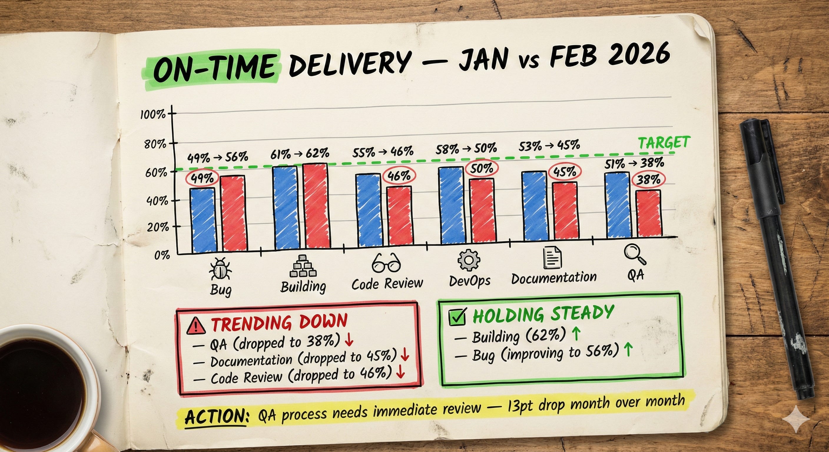
Here is the prompt I used to create the chart in Nano Banana:
Handwritten notebook page photographed from above on a wooden desk. The page is cream/off-white with a slightly worn, lived-in feel. The content is a hand-drawn monthly KPI dashboard titled "ON-TIME DELIVERY — JAN vs FEB 2026" in bold black hand-lettered text with "ON-TIME" highlighted in green.

The main section shows a hand-drawn bar chart comparing January (blue bars) and February (red bars) across six task types. Each pair of bars has the exact percentages written clearly above in marker:

Bug: 49% → 56%
Building: 61% → 62%
Code Review: 55% → 46%
DevOps: 58% → 50%
Documentation: 53% → 45%
QA: 51% → 38%

A hand-drawn dashed line at the 60% mark is labeled "TARGET" in green. Bar heights match these exact percentages.

Below the chart are two callout boxes. A red-bordered box titled "⚠ TRENDING DOWN" lists:
— QA (dropped to 38%) ↓
— Documentation (dropped to 45%) ↓
— Code Review (dropped to 46%) ↓

A green-bordered box titled "✅ HOLDING STEADY" lists:
— Building (62%) ↑
— Bug (improving to 56%) ↑

Small hand-drawn icons beside sections — a bug doodle next to Bug, a gear next to DevOps, a magnifying glass next to QA, a document icon next to Documentation. Key percentages below 50% are circled in red.

A yellow highlighted callout at the bottom reads: "ACTION: QA process needs immediate review — 13pt drop month over month"

Flat lay photography, natural overhead lighting, slight page curl at edges, realistic paper texture. A pen and coffee cup are visible at the edge of frame.